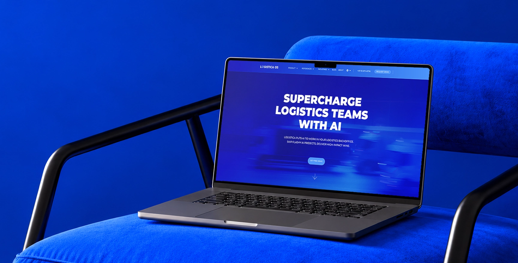
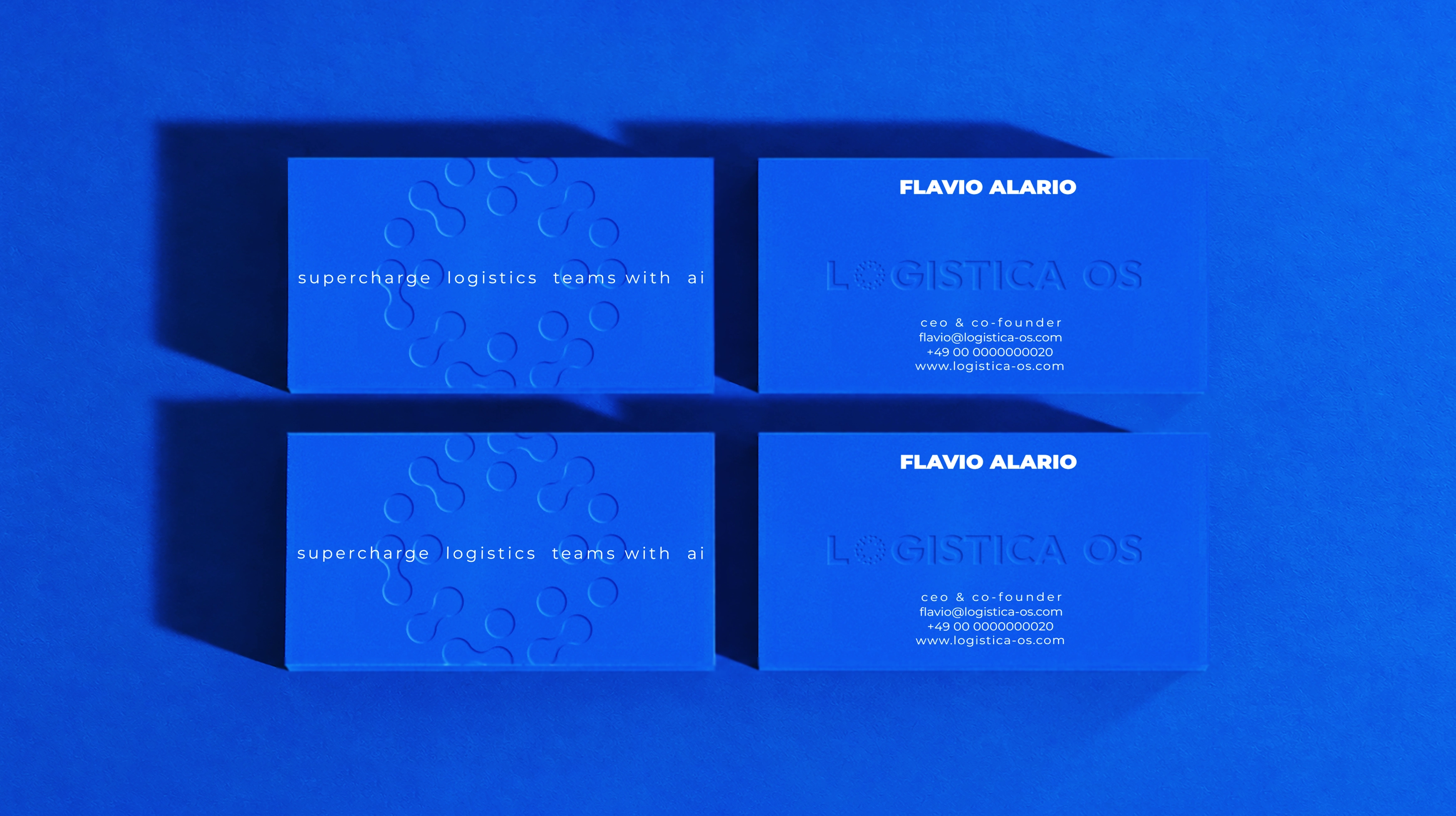
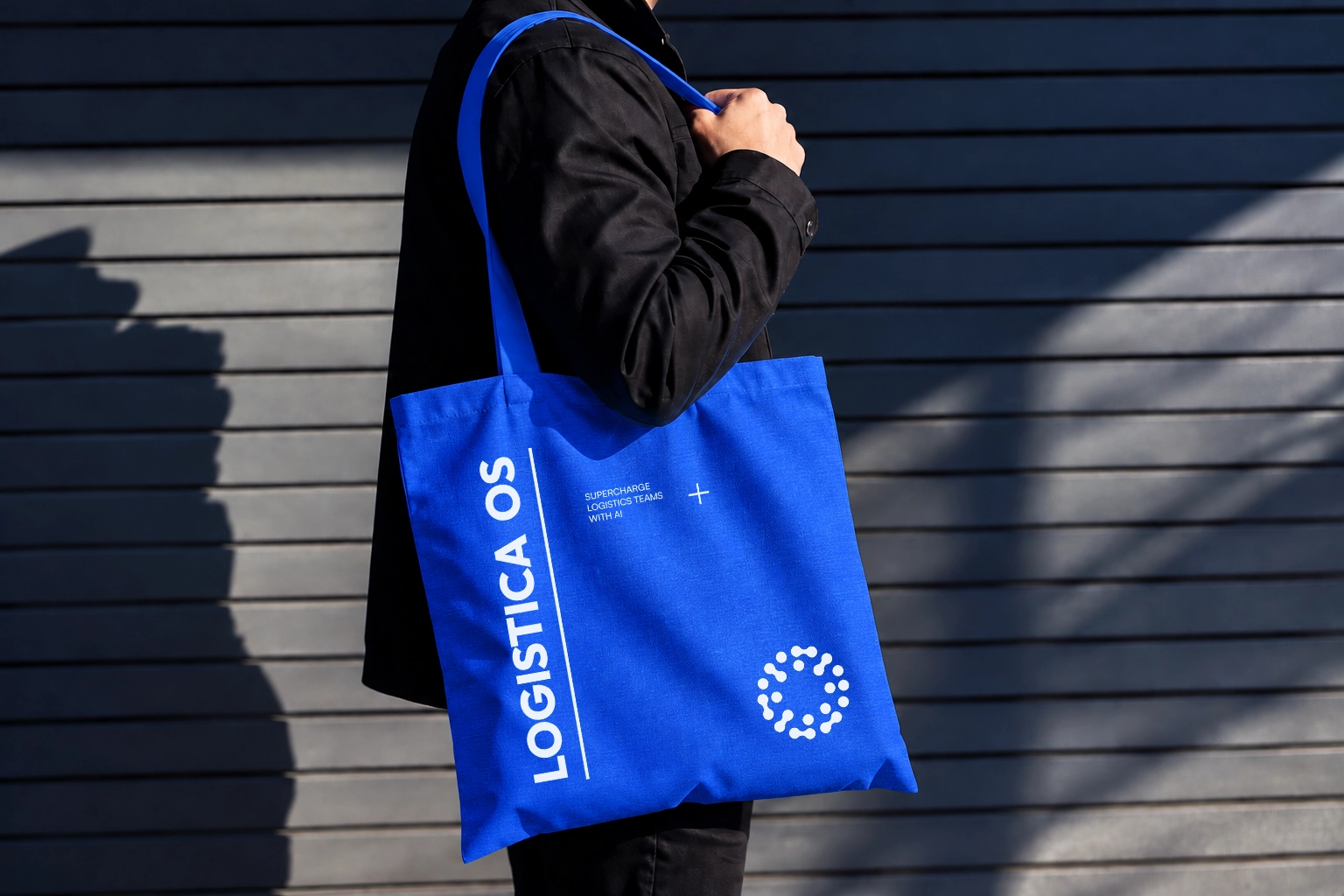
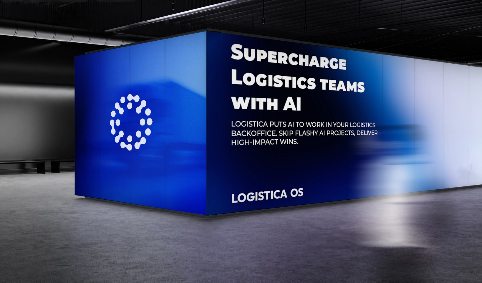
A New Expression of the Same System.
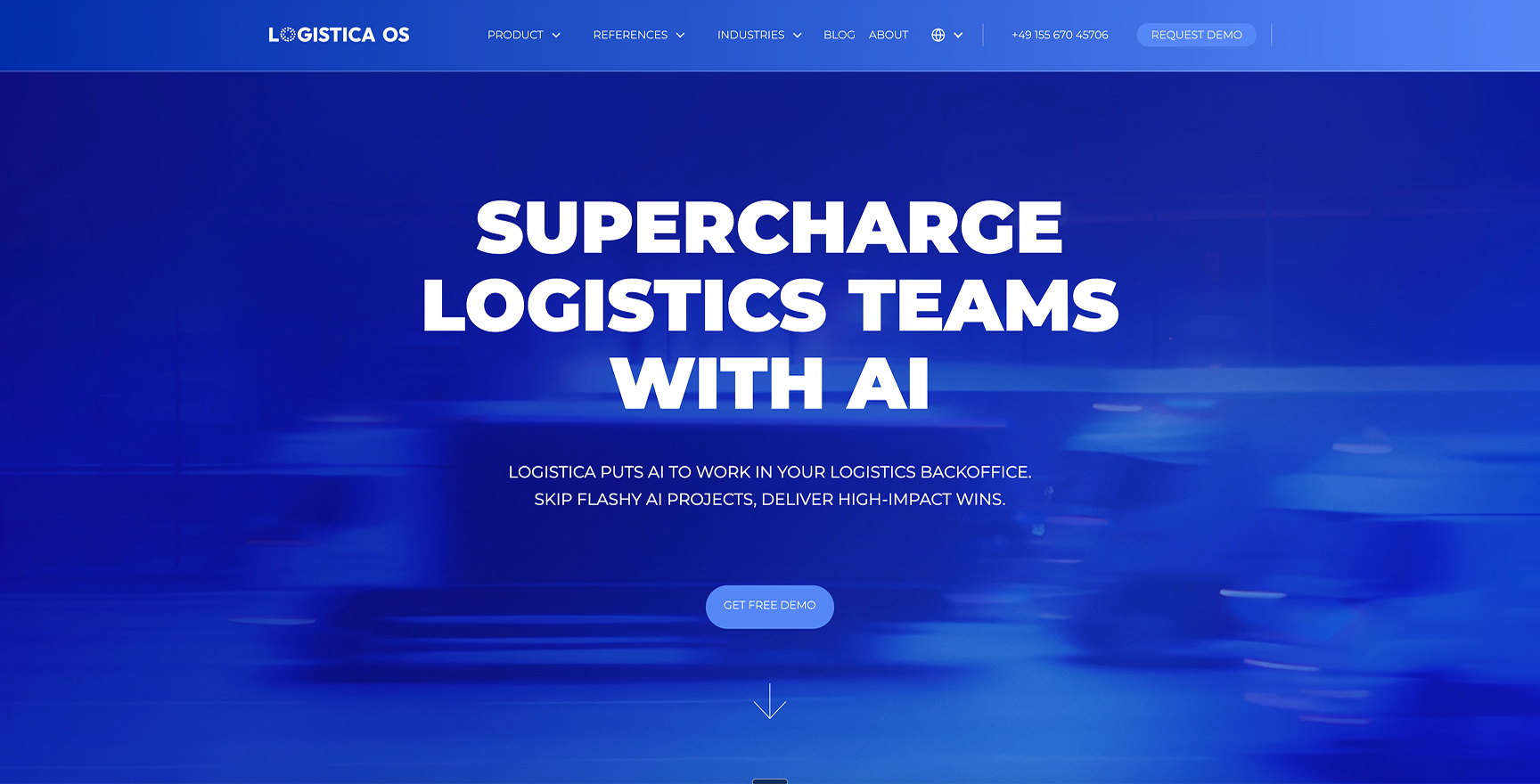
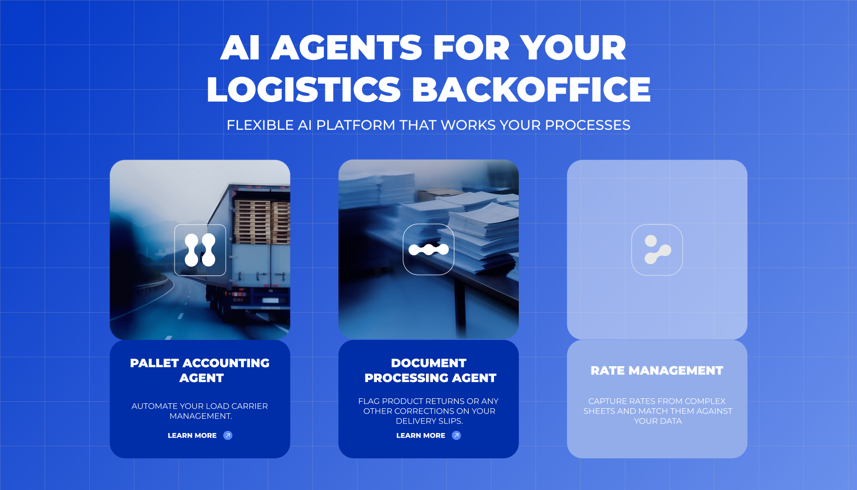
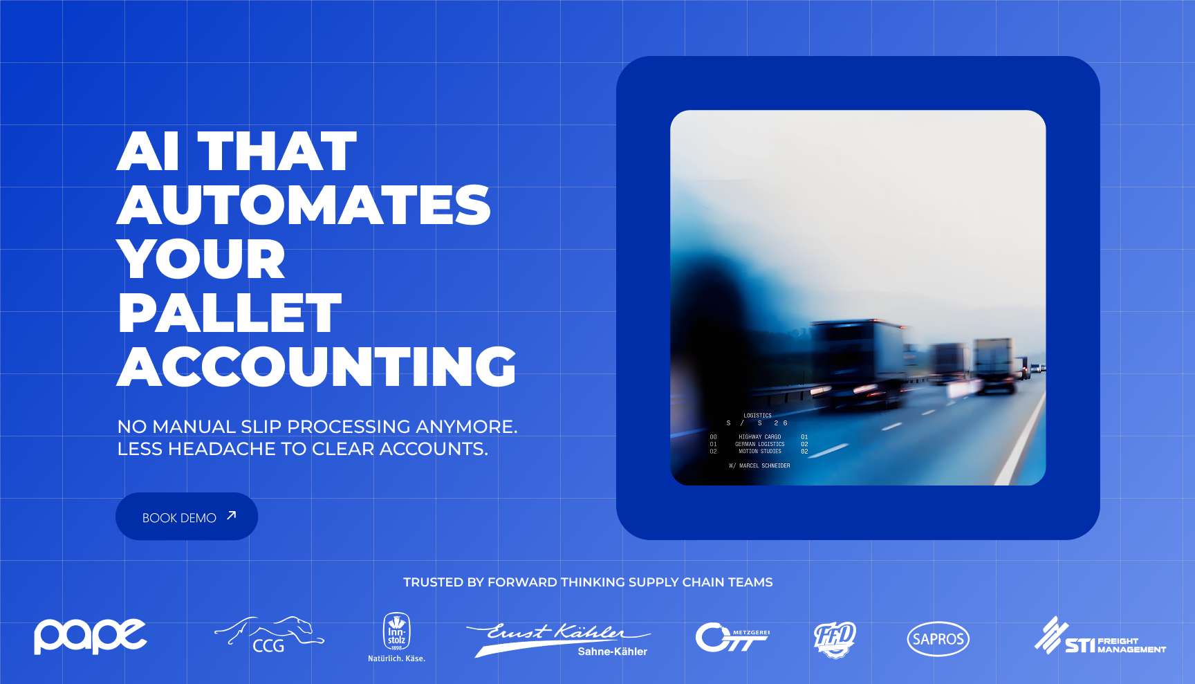
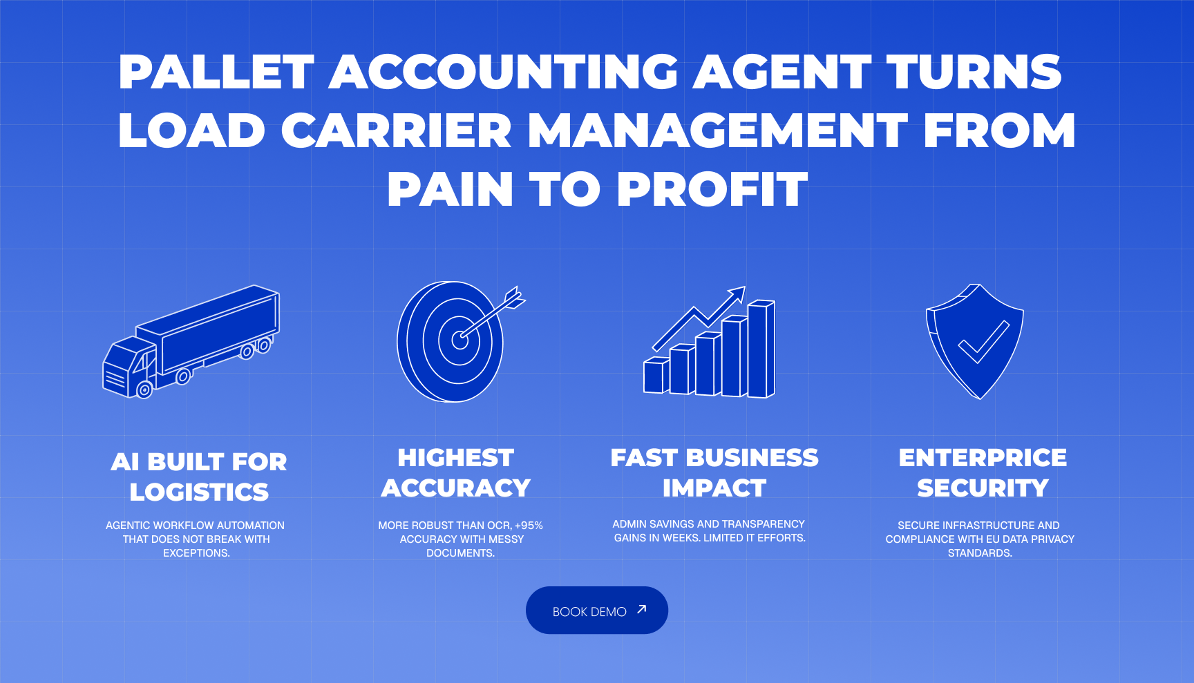
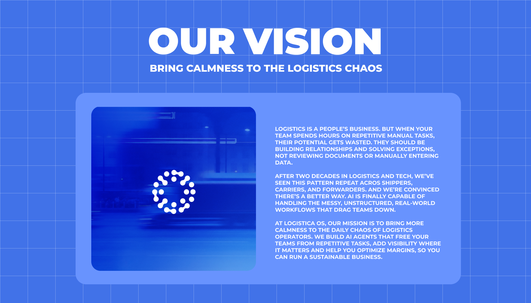
The rebrand keeps the core of the Logistica OS identity intact. The strict, modular grid remains the foundation, continuing to communicate structure, precision, and the systematic nature of logistics.What changes is the layer that brings the system to life.Previously, the identity used illustration to complement the grid and represent the world of Logistica OS.
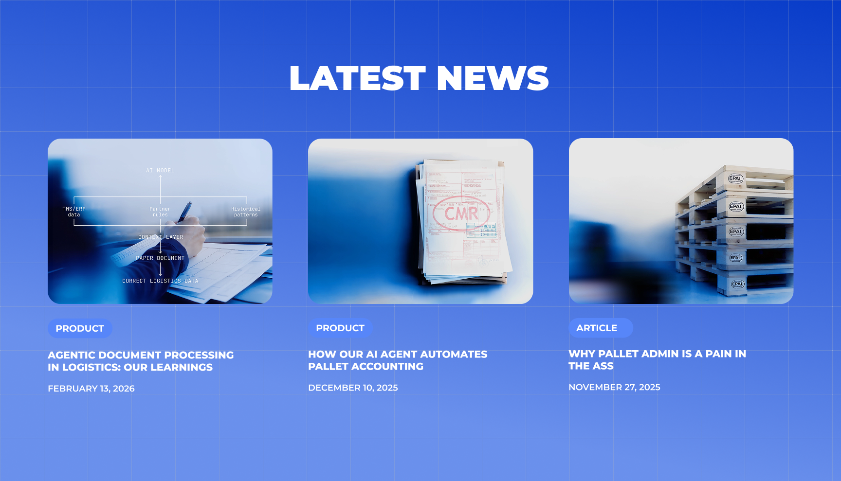
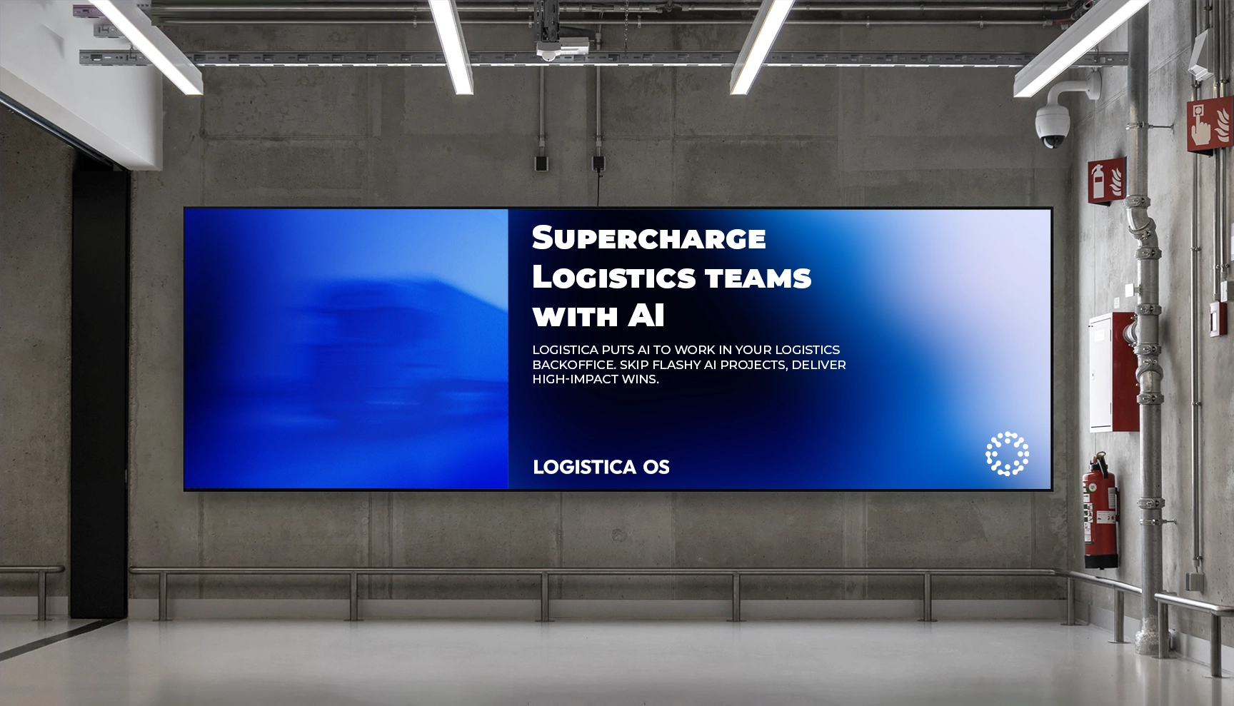
The new identity replaces this illustrative layer with cinematic, motion-led photography. Rather than depicting logistics literally, the imagery interprets the industry through movement, light, texture, scale, and atmosphere.This creates an opportunity to reveal the beauty within logistics. Warehouses, vehicles, materials, infrastructure, and movement become raw material for a more artistic visual language.
The industry is shown through an unexpected lens, turning familiar operational environments into imagery that feels expressive, sophisticated, and distinctive.The result is a visual identity that remains structured at its core, but feels more dynamic, memorable, and contemporary. The grid provides the discipline. Cinematic photography introduces emotion and movement. Together, they create a visual language that reflects logistics without looking like traditional logistics branding.The system stays the same. The way we see the industry changes.